Introduction
Voluntopia is a new mobile application that motivates a community to make small differences little by little through micro-volunteering. The most accepted definition of micro-volunteering is “bite-sized, on-demand, no commitment actions that benefit a worthy cause.”
The more of the actions you complete, the more your community can benefit.
Role: UI Designer, Interaction Designer
Tools: Sketch, Invision, Illustrator, Photoshop
Deliverables: High fidelity mockups; Prototype; Style guide; UI kit
Timeline: 4 Weeks
The Challenge
Our challenge was to develop the branding and identity for the Voluntopia application. Over the course of four, week-long sprints, create fully-realized, high fidelity prototype, as well as a UI kit and style guide. The application should be a visual brand experience that encourages users to get involved in their communities and integrate easily into users’ lives.
The Audience
Voluntopia’s target audience is anyone who wants to make a difference in the world and use quick and fun ways to do so. While the applications should be accessible to a larger audience, it should specifically target young, busy professionals ages 20-35.
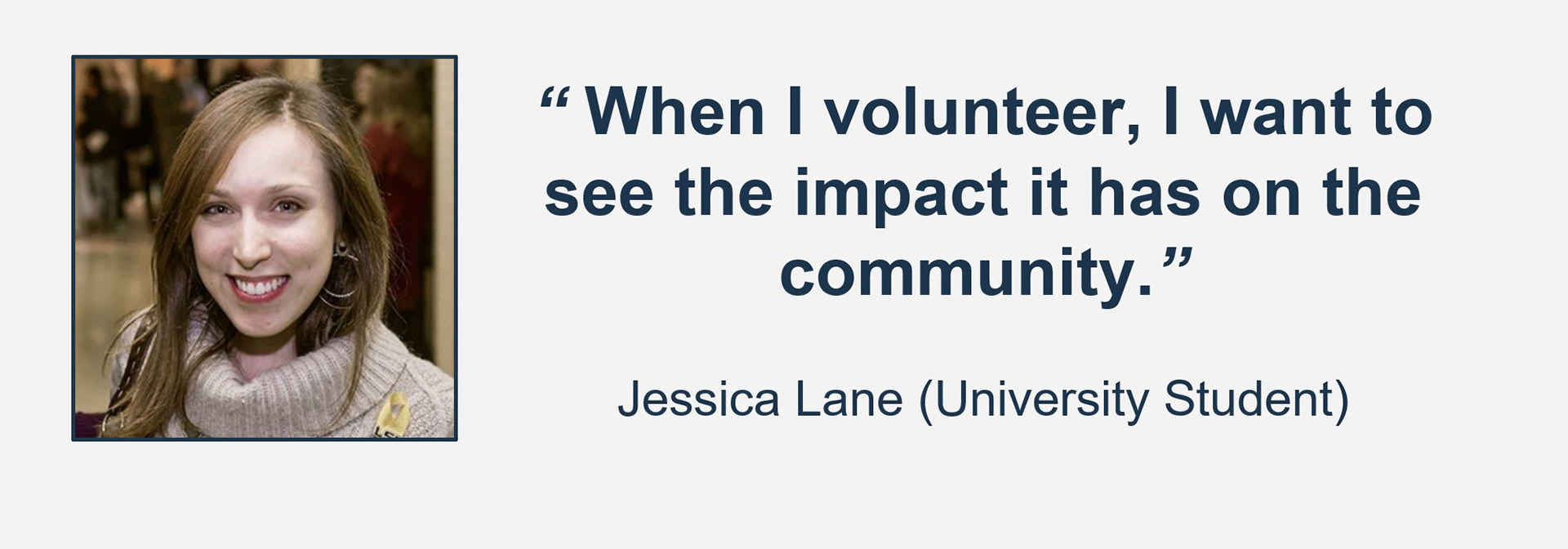
Meet Jessica
Our persona Jessica, is a 20 year old college student who is extremely busy but has an interest in helping her community.
Motivations:
+ Get better acquainted with her community.
+ Discovering new & fun social experiences.
+ Discovering new & fun social experiences.
Jessica's Frustrations:
+ Unable to find volunteer activities that accommodate with class & work schedules.
+ Unsure of her impact.
+ Unsure of her impact.
Jessica's Wants"
+ To feel like she’s making an impact.
+ To find well-run organizations.
+ To find well-run organizations.
Goals and Objectives
The goal for our user, Jessica, was to make sure that her time is valued and that she can see the impact she is making within her community. How can we meet these goals with the Voluntopia app?
1. Facilitate quick micro-volunteering opportunities.
2. Incorporating the gamification reward theory to incentivize long time users.
3. Help build social connections.
Research & Analysis
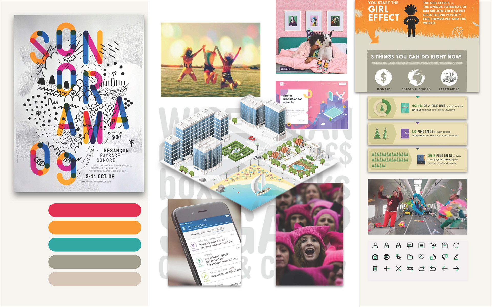
Competitive Analysis
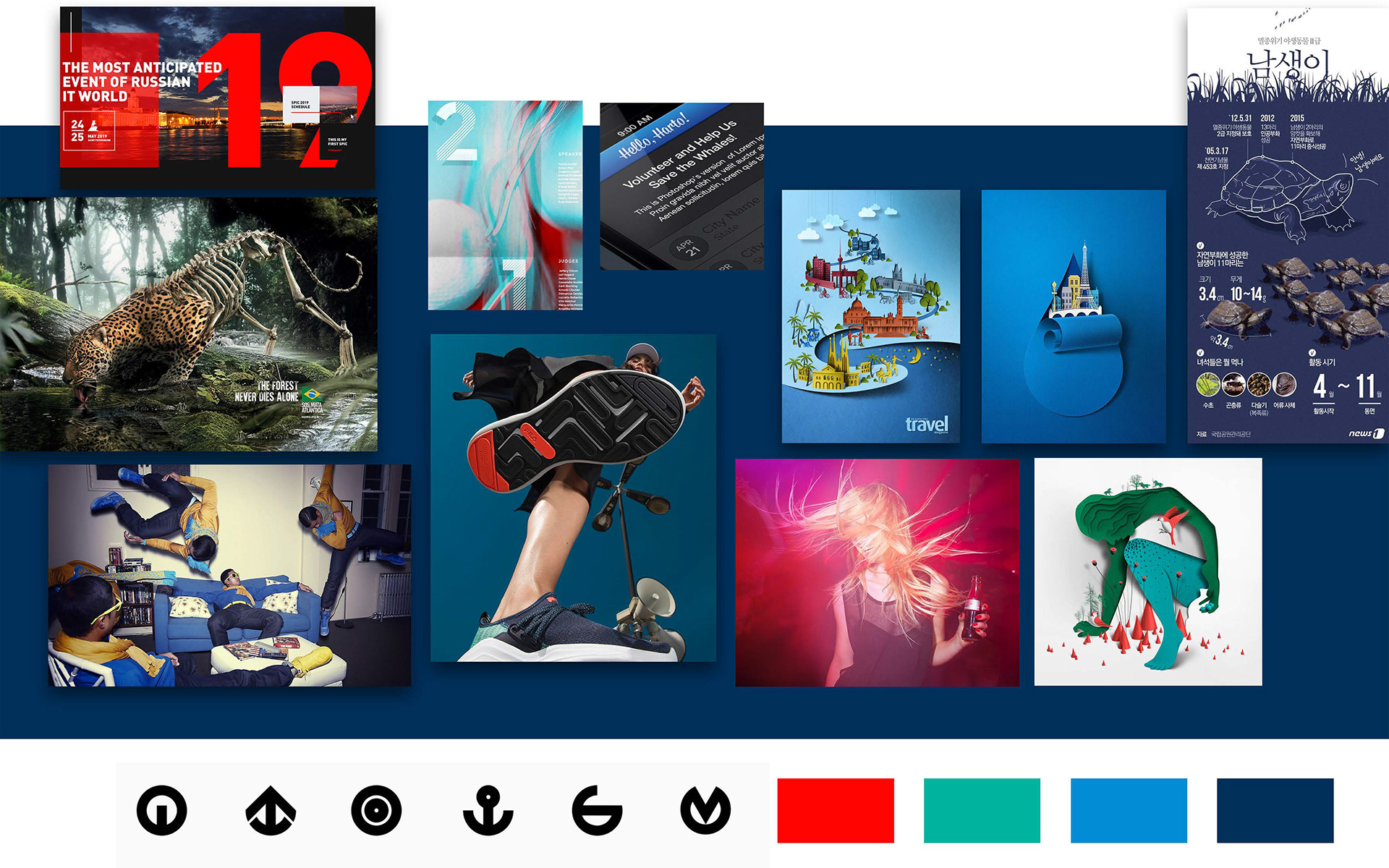
To help define our direction, we conducted a visual competitive analysis. We researched 6 of Voluntopia's competitors (3 direct, and 3 indirect) for commonalities to emulate, as well key opportunities for our team to differentiate the app from similar products in the market. We examined UI elements, interaction patterns and various layouts to give us an idea of what competitors are doing in the market. We documented this data in a large spreadsheet for easy comparison across the various categories.
Upon further analysis of the emerging patterns the team identified a few key takeaways that we were able to focus on moving forward.
The Direct Competitors:
Used gamification to entice users
There is an opportunity to increase long term engagement by using an innovative method like gamification.
There is an opportunity to increase long term engagement by using an innovative method like gamification.
Used design elements that guide users through the application
Visual affordance will also help increase user's long term engagement.
Visual affordance will also help increase user's long term engagement.
Used elements to showcase rewards.
Seeing some kind of element that promotes success will help the user recognize their impact. This also adds to the idea of instant gratification through rewarding their interaction which can result in motivation to continue using the product.
Seeing some kind of element that promotes success will help the user recognize their impact. This also adds to the idea of instant gratification through rewarding their interaction which can result in motivation to continue using the product.
Used visual ques to indicate next steps
By using micro interactions and progress bars the user knew where they were in the volunteering process. We found this method to be not only pleasing but effective for the user in motivating them to have further engagement.
By using micro interactions and progress bars the user knew where they were in the volunteering process. We found this method to be not only pleasing but effective for the user in motivating them to have further engagement.
Design Principles
With a better idea of what was working and where there was room for improvement in the existing market, our team created 3 design principles. We created these guiding principles to facilitate our design decisions as we continued through our design process.
Impact Recognition
Users feel great when they volunteer! If we recognize their accomplishments in the app they will more likely to continue using the app to find volunteering opportunities.
Takeaway from research:
Visually recognize and appreciate user’s impact

Never Noisy
Minimize visual distractions such as unnecessary graphics or lengthy test so the user can accomplish tasks effortlessly. Include only essential visual elements that have a clear purpose.
Takeaway from research:
Keep design efficient and streamlined to respect the user’s time constraints.
Guide the User
Use visual cues and indicators to assist users as they navigate the app and complete tasks. Users should always know what to do next and how to progress to the next level.
Takeaway from research:
Visually guides users through every step.

Exploration
Style Tiles - Exploring Solutions
From the research and analysis, each designer created 3 styles tiles for a total of 9 concepts that explored divergent design directions for the app. My three style tile directions that I felt would resonate with different aspects of our users like Jessica's lifestyle.
CONCEPT 1
Fun and Informative Inspired by colors found in nature
Fun and Informative Inspired by colors found in nature
CONCEPT 2
Bold and Engaging primary color pallete
Bold and Engaging primary color pallete
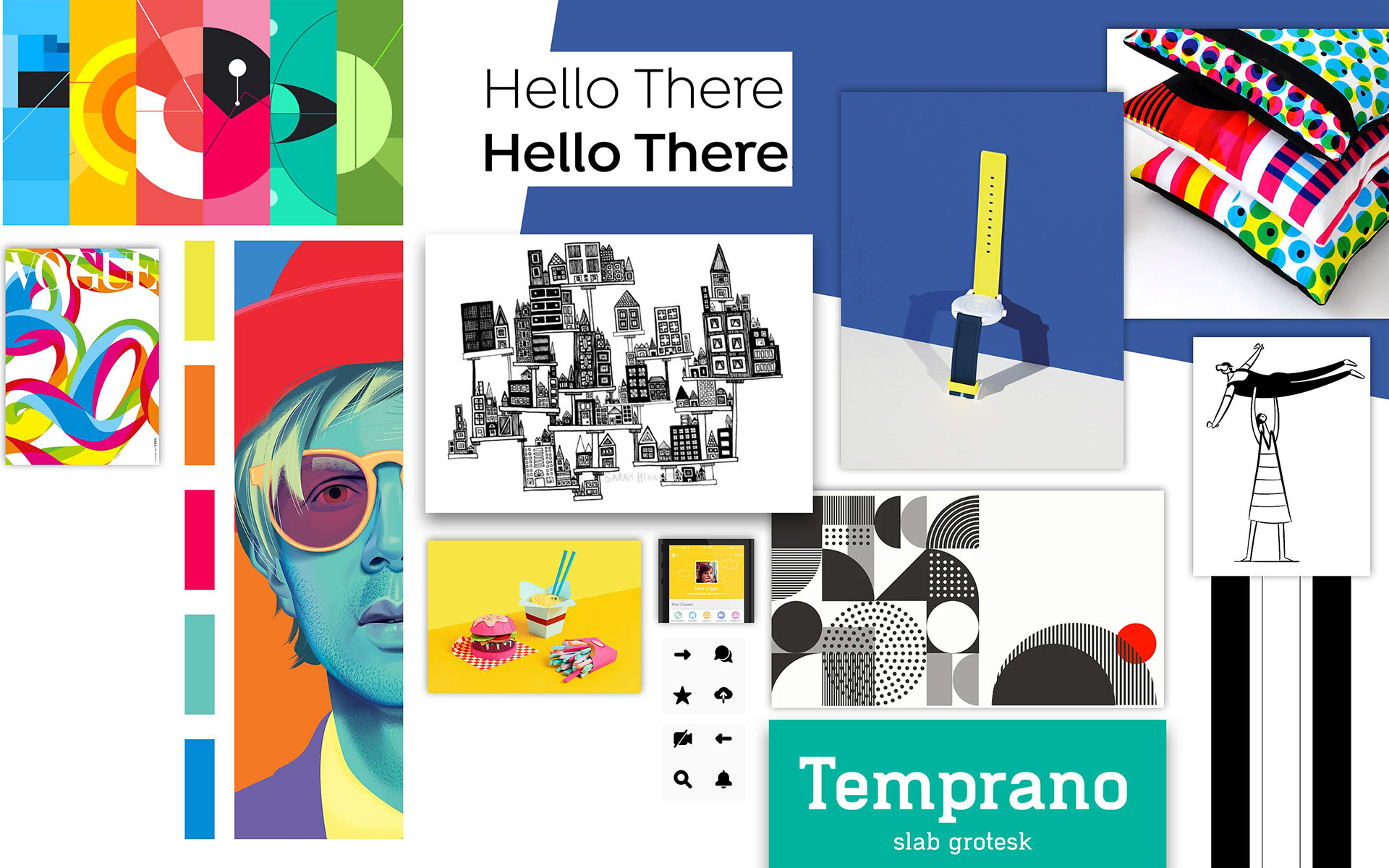
CONCEPT 3
Modern and relatable with a familiar pallete of red and navy blue.
Modern and relatable with a familiar pallete of red and navy blue.
Testing Concepts for Best Design Direction
Our objective for each of our testing sessions was to understand our users perception of the designs through each of our iterations in order to justify our design decisions.
Through our testing I found that the users had a slight preference for the first concept. I wanted this direction to feel warm and welcoming, but still modern. I kept in mind adjectives like fun, social, and informative to align with our design principles. The users that we tested described this concept as friendly and welcoming. One user stated that the look and feel of the style tile...
"Feels like you will be doing something for the common good."
- Quote from one of our testers
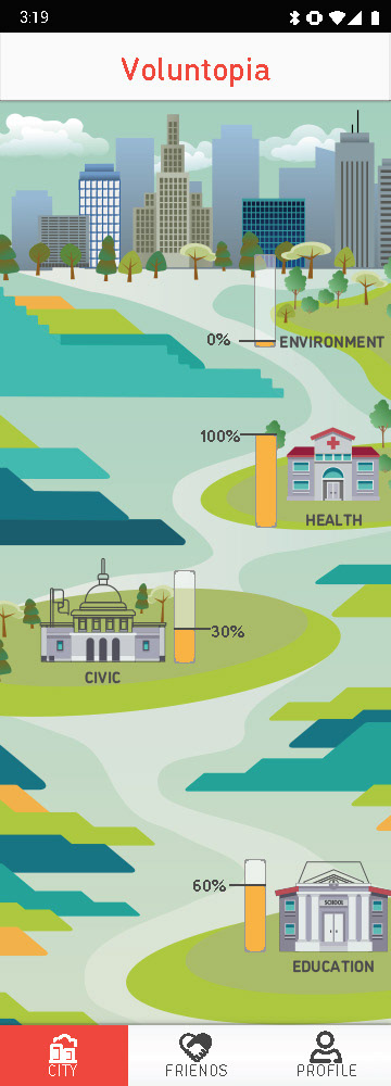
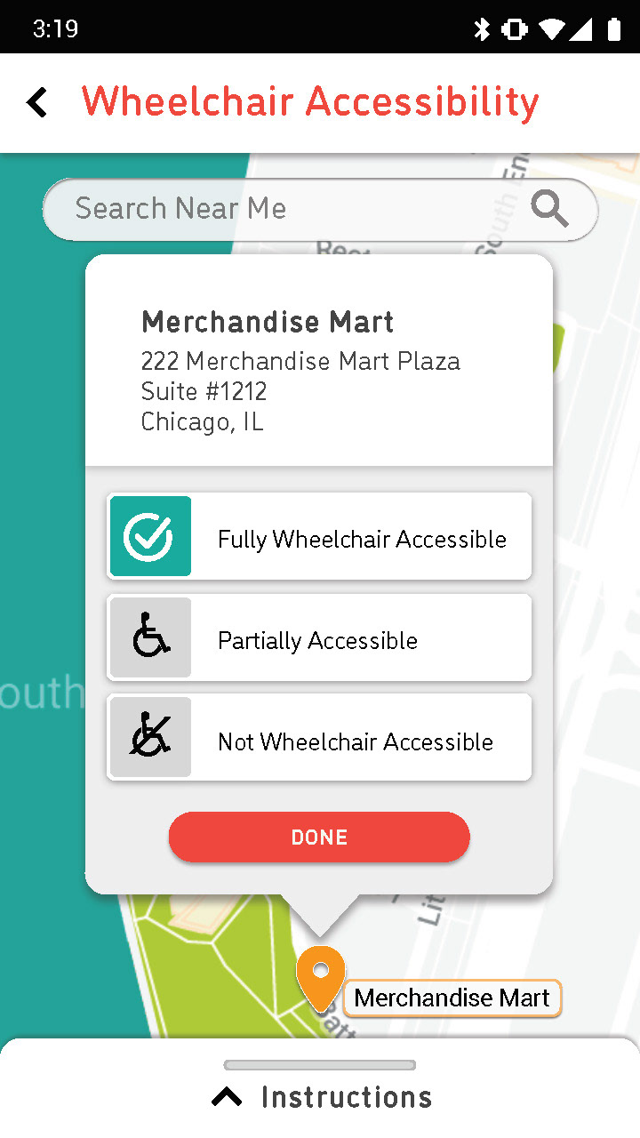
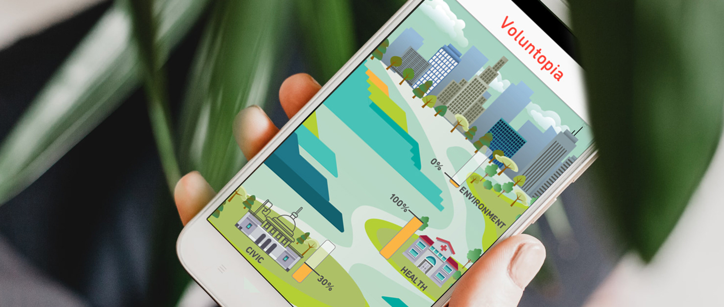
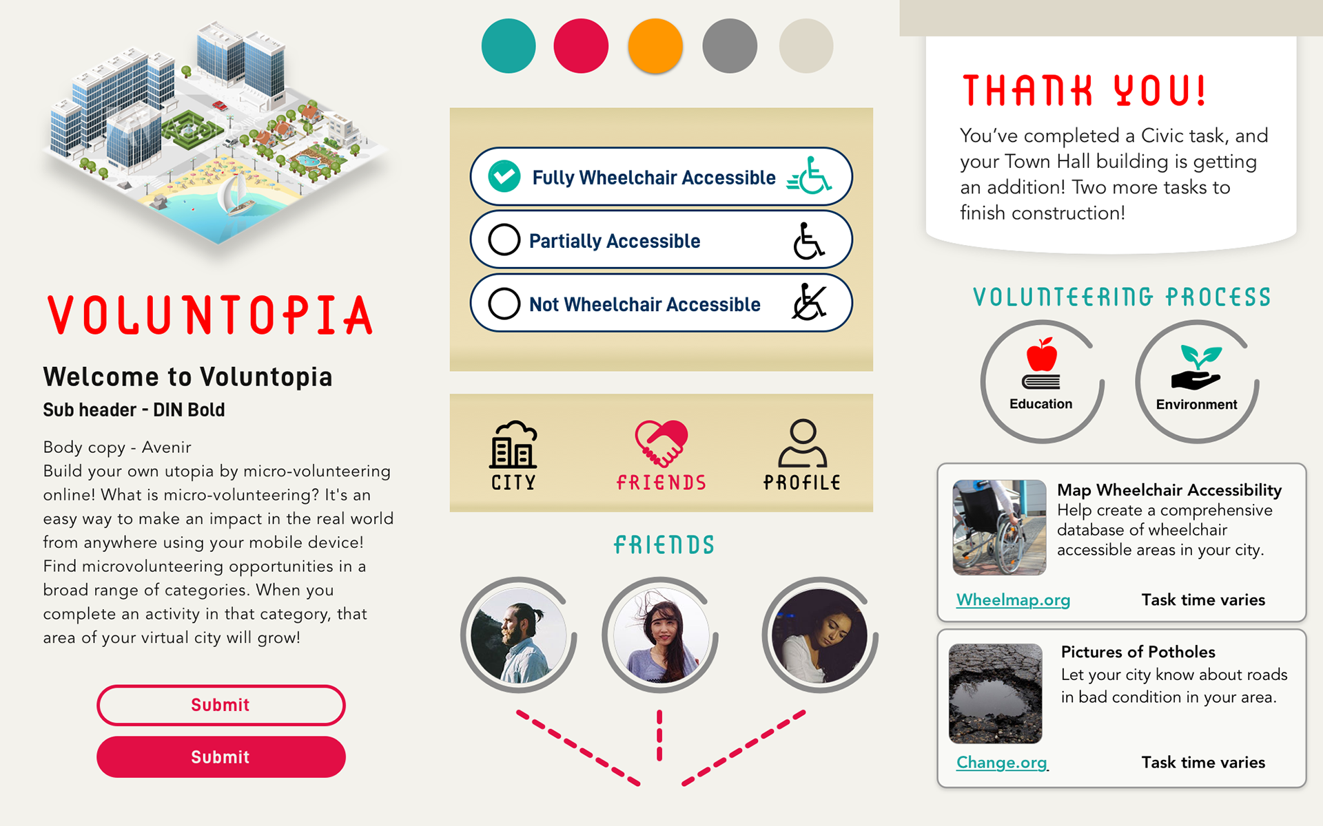
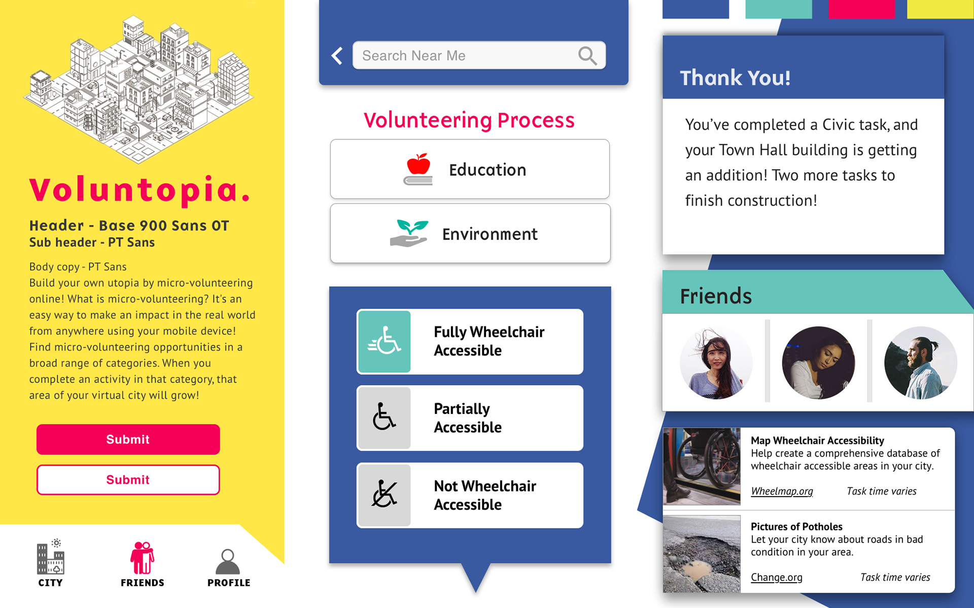
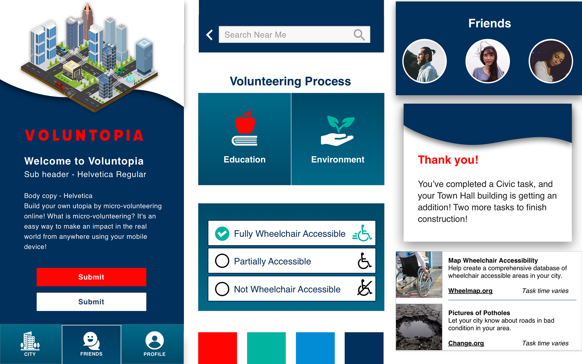
Voluntopia Map Screen
Pull the slider left and right in the pull slide demo image to see the "before" and "after" iterations.
The gamification aspect of Voluntopia was critical part of the application. So the CITY screen was going to be one of the most important differentiators.
COLORS:
But again, the users felt the bright blues, reds, and orange colors in this initial design (left side on the pull-slide demo) were distracting.
DISCONNECTED:
The majority of users we tested thought the light blue color resembled water which made it feel like the different areas like Civic building, Education, and Environment were floating and disconnected from one another. They wanted to see some way to travel from one municipal building to the next.
SOLUTION:
My solution (see demo image on the right side) was to tone down the color pallete by introducing more natural shades of green.
I added the cityscape to the background and added 'paths' like sidewalks that connect all of the buildings to each other.
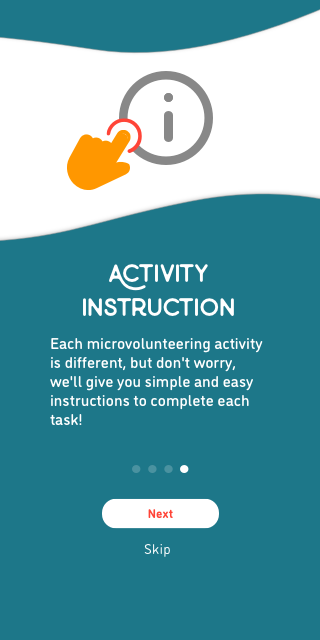
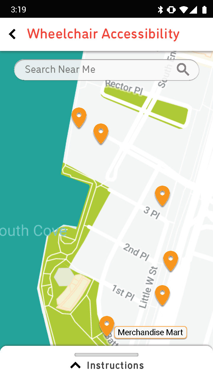
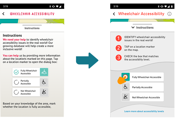
Instructions Screen
One screen that was in need of several iterations was the INSTRUCTION page. Based on the feedback from the users, they did not love the overall color usage. I spent some time researching the MATERIAL DESIGN color palette guidelines and reworked my color palette.
COLORS:
I replaced the beige which gave was reported to give a dated feel with a more modern gray tone for the backgrounds instead.
I kept the red color but used it only as an accent in the design as well as for my primary Call To Action buttons.
SIMPLIFY:
Keeping in line with our design principles, I reviewed the text heavy copy from the wireframes and reduced it down to the essential information. Adding in the numbered steps broke it up and was seen to be less overwhelming for the users.
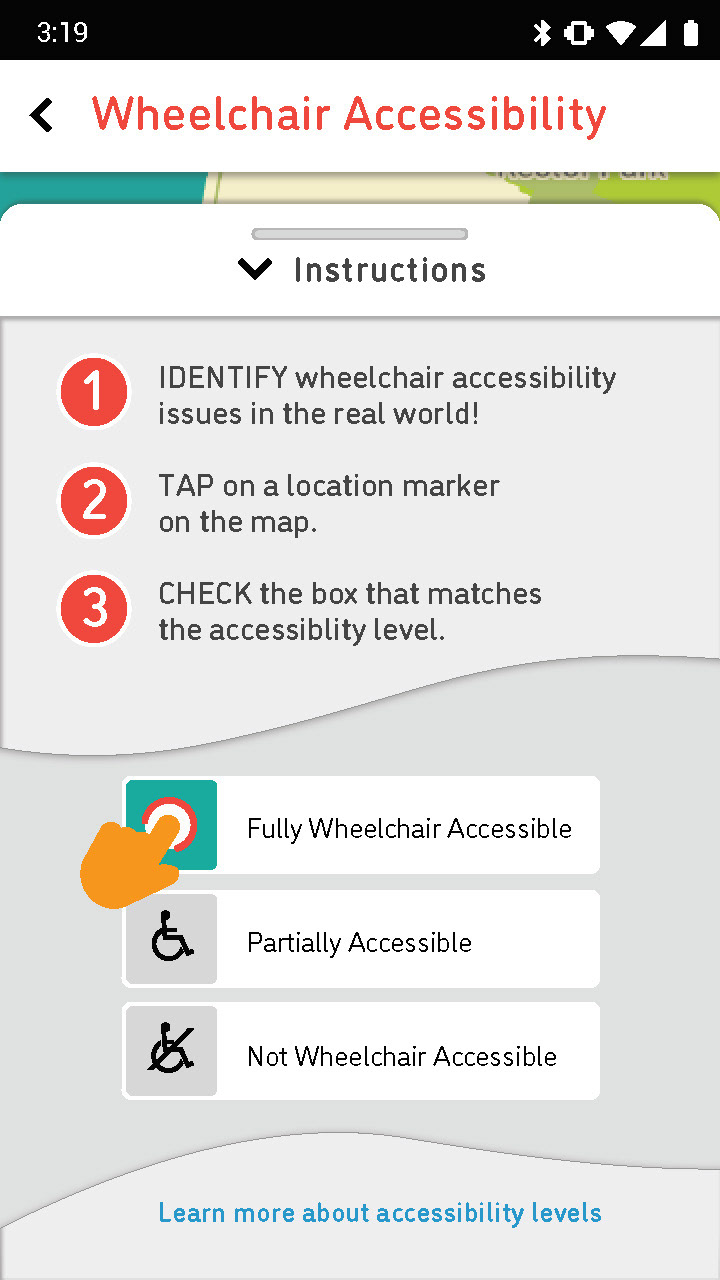
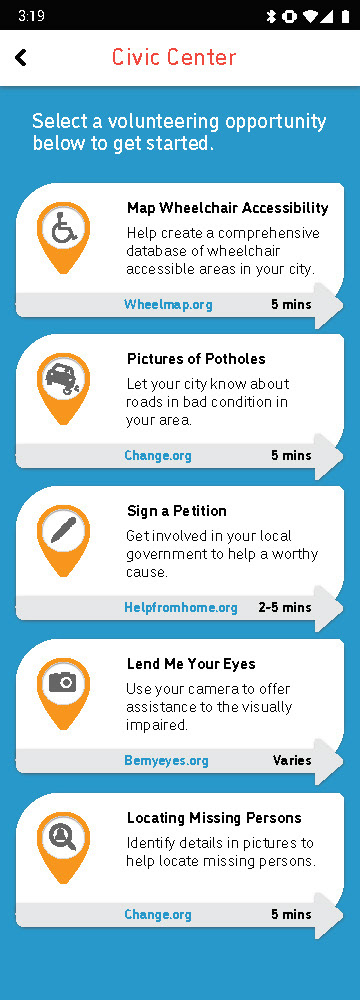
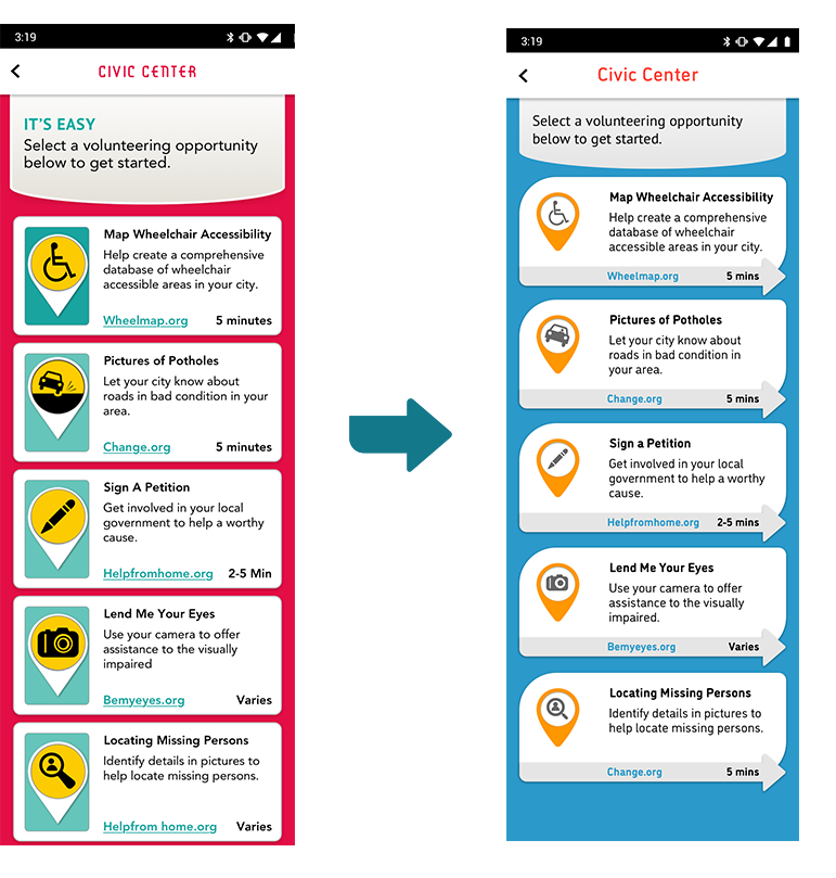
Task Selection Screen
Another key screen that went through several iterations based on user feedback the task screen. The test re
COLORS:
Users did not care for the color usage on the initial screen. They voiced that the red and yellow on the same screen looked like a traffic warning sign. I replaced the red background color with the blue.
CALL TO ACTIONS:
Next, I extended the shape of the task cards to the shape of an arrow as a visual que that these were also CTAs.
ICONS:
Finally, I again used the new and less abrasive color pallet and selected simplified and more refined icons.
Final High Fidelity Designs & Prototype
After testing each iteration of high fidelity screens and developing key insights, design decisions and strategies, here are the final high fidelity screens:
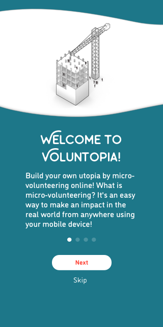
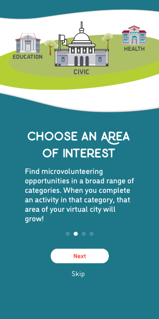
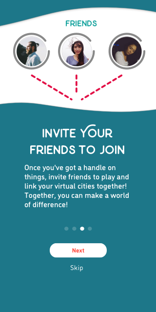
Onboarding Screens