The Challenge
Over the last 10 years, the fitness industry has been moving away from the traditional gym setting, towards a more luxurious experience offered by new boutique fitness classes. This shift has given rise to a more fashion-conscious fitness consumer. Grip + Band is in the process of launching an innovative new brand in this premium fitness/athleisure space. Our client, discovered that despite the increasing number of athleisure options catering to the premium consumer, this has not extended beyond traditional apparel. She is creating GRIP + BAND to cater to this new niche in the marketplace.
Our challenge was to create a website prototype for the new premium athleisure brand called GRIP + BAND.
Role: UI Designer, Interaction Designer
Tools: Sketch, Invision, Illustrator, Photoshop
Deliverables: High fidelity mockups of key screens; UI-focused style guides; UI Kit
Timeline: 4 Weeks
The Audience
The target customers of GRIP + BAND are women age 22–45 who take boutique fitness classes. They care about style and fashion, and are willing to pay more for the premium products. The target user is also accustomed to viewing and shopping on Instagram and social media. There is a secondary audience called ‘Bandmates’ that GRIP + BAND plans to build a community around.
Persona 1
A 25-year old woman who uses social media for brand discovery, likes being on the “in” of the latest trends
A 25-year old woman who uses social media for brand discovery, likes being on the “in” of the latest trends
Persona 2
A 33-year old working professional who likes accessories that feel unique, personalized. Different enough to make an impression but also classic.
A 33-year old working professional who likes accessories that feel unique, personalized. Different enough to make an impression but also classic.
Persona 3
A 42 year old mom who’s detail oriented, and cares about having products that improve their lives / make them smile among an otherwise hectic day
A 42 year old mom who’s detail oriented, and cares about having products that improve their lives / make them smile among an otherwise hectic day
Goals and Objectives
Apart from a logo that has already been designed, the main goal of this project was to define the brand and how it will be expressed across Grip + Band’s web platforms. At the core of this was building a strong and inspirational brand voice that differentiates both it’s product and brand from competitors.
Reasearch & Analysis
Competitive Analysis
To help define our direction, we conducted a visual competitive analysis. We examined 6 of GRIP + BAND competitors (3 direct, and 3 indirect) for characteristics to emulate, as well as differentiate. We examined several factors including color usage, use of Illustrations and graphics, photography, micro interactions, layout, navigation, UI elements, Call to actions, typography, data visuals, white space, hierarchy, who was their target audience, and overall look and feel. These could lead to opportunities for improvement from what users see from GRIP + BAND’s competitors websites.
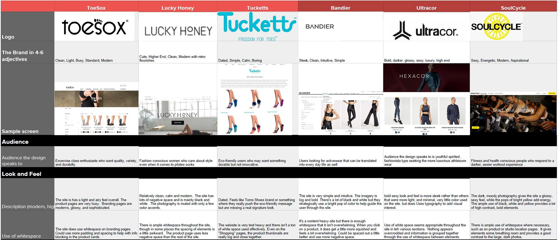
After conducting our extensive analysis of the competitive landscape, we were able to form some valuable insights and key takeaways.
COLORS - DIFFERENTIATE: Curiously, most of the competitors used a monochromatic palette of white, black and grey. Adding more color will differentiate GRIP+BAND

PHOTOGRAPHY - DIFFERENTIATE or EMULATE: Include lifestyle photography that helps the user feel more connected to the brand. Product photography - It was all very similar so there is an opportunity to use another approach that is more editorial or uses more color to stand out.

TYPOGRAPHY - DIFFERENTIATE: With most of the major competitors using san serif fonts, there was an opportunity to differentiate with a serif headline that would be more unique.
IxA PATTERNS - EMULATE: Continue using intuitive patterns that align with what users expect to see on an e-commerce site.
Design Principles
Elevated Energy
Use a luxurious feel that reflects the products and the athletic energy they represent. The design should feel sophisticated and premium but still approachable for all users.
Use a luxurious feel that reflects the products and the athletic energy they represent. The design should feel sophisticated and premium but still approachable for all users.
Simply Seamless
Intuitive design patterns that minimize any confusion while navigating the content heavy site. The design should be minimal and clean.
Intuitive design patterns that minimize any confusion while navigating the content heavy site. The design should be minimal and clean.
Creatively Collective
The design will encourage users to engage with the site in different ways. The design will make the user feel welcome as Bandmates and will be excited to interact with their community.
The design will encourage users to engage with the site in different ways. The design will make the user feel welcome as Bandmates and will be excited to interact with their community.
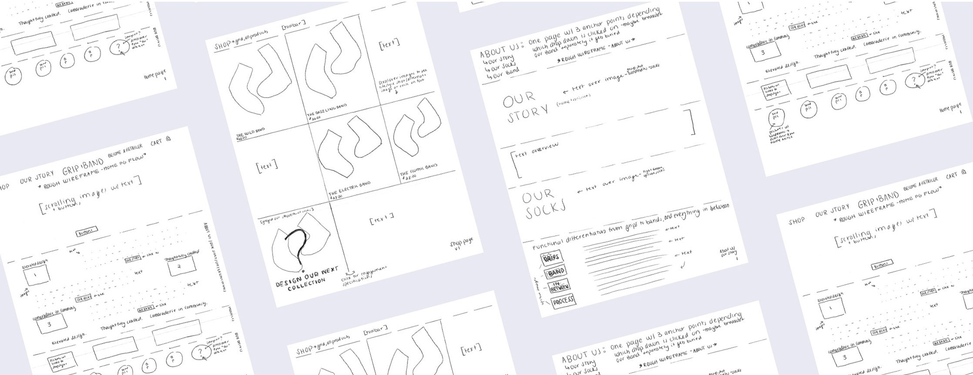
Exploration
Style Tiles - Exploring Solutions
From the research and analysis and keeping in mind our design principles, I worked on 3 concepts that explored divergent design directions that would stand apart from other websites in the marketplace.
CONCEPT 1
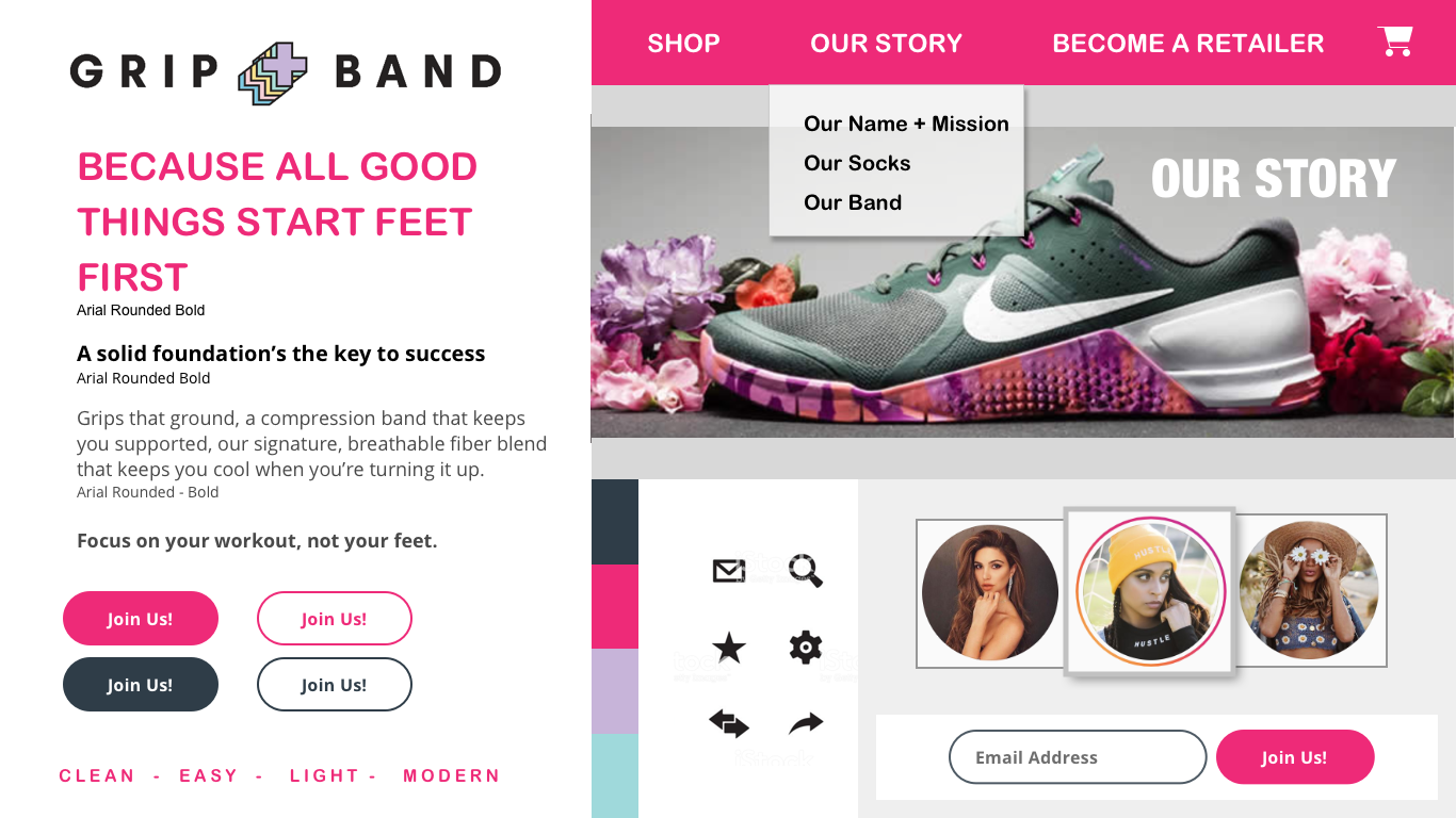
Palm Beach Chic
Palm Beach Chic
Inspired by warm sunshine and turquoise blue water. These vibrant accent combined with a foundation of white and creams is both clean and classic.
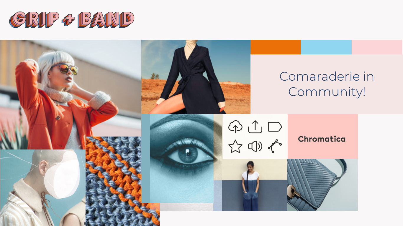
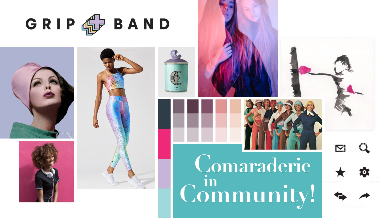
Moodboard - Clean & Classic
Style Tile - Clean & Classic
CONCEPT 2
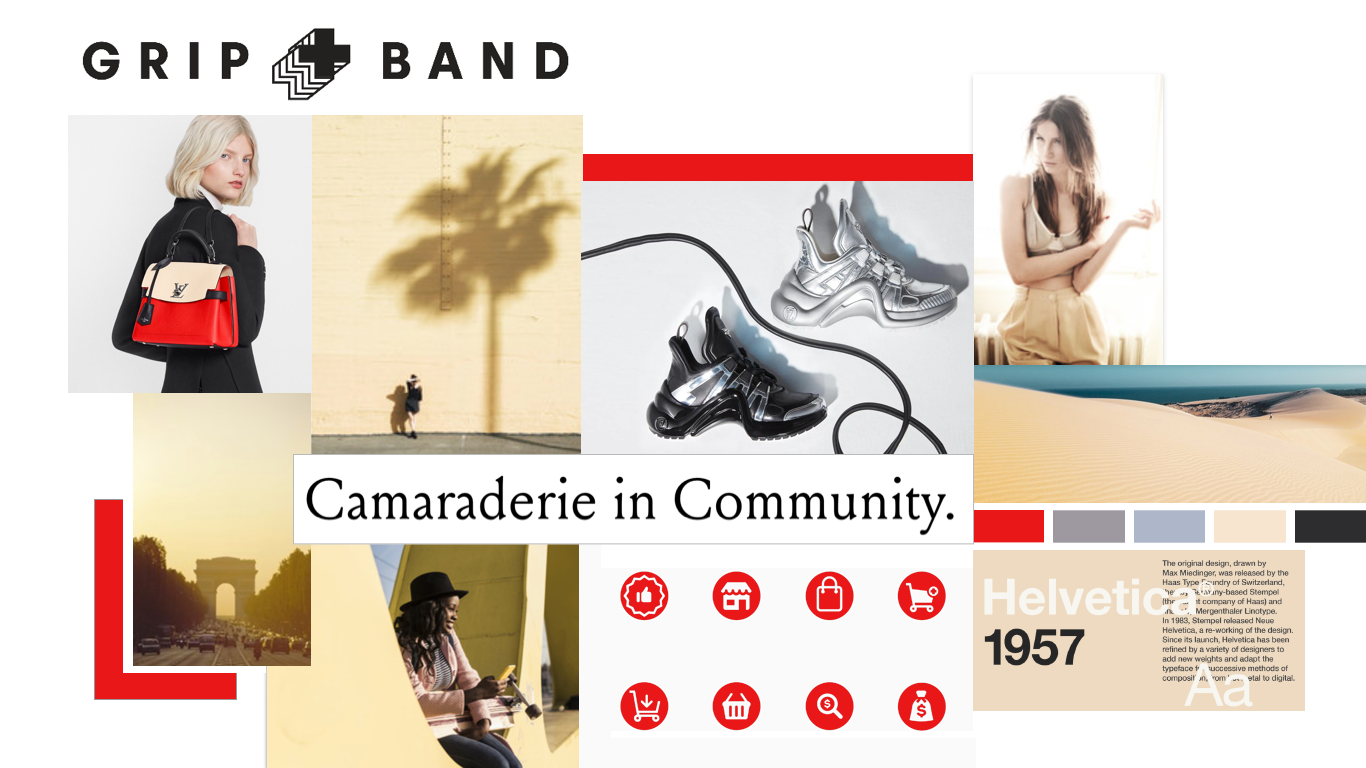
Bold & Modern Luxury
Bold & Modern Luxury
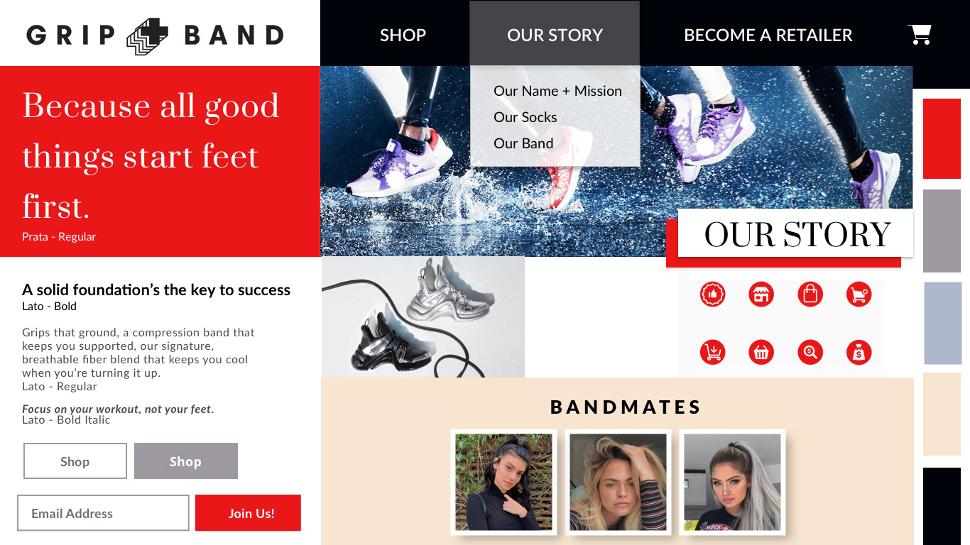
I wanted to appeal to the users and their affintiy to prefer the more classic luxury brands through the use of a classic color palatte consisting of black, tans, with red accents.
CONCEPT 3
Playful Retro Vibe
Playful Retro Vibe
I explored the user's desire to stay healthy, and vibrant. Through the use of this highly saturated pallete of pinks and purples hues creates a youthful and energetic feel.
Testing Concepts for Best Design Direction
2 Rounds of Testing
A majority of the users that the client provided for testing were considered SMEs having backgrounds in fashion, the boutique fitness industry, as well as being influencers in the social media space.
A majority of the users that the client provided for testing were considered SMEs having backgrounds in fashion, the boutique fitness industry, as well as being influencers in the social media space.
All three design concepts tested positively with the users, and revealed a very close preference between the first and third design directions. Given these results and discussing further with our client, I went forward with concept 1 with the intent of incorporating the playfulness that the users responded to in the third concept.
“Fun, feminine - I like the color scheme.”
- Quote from one of our testers
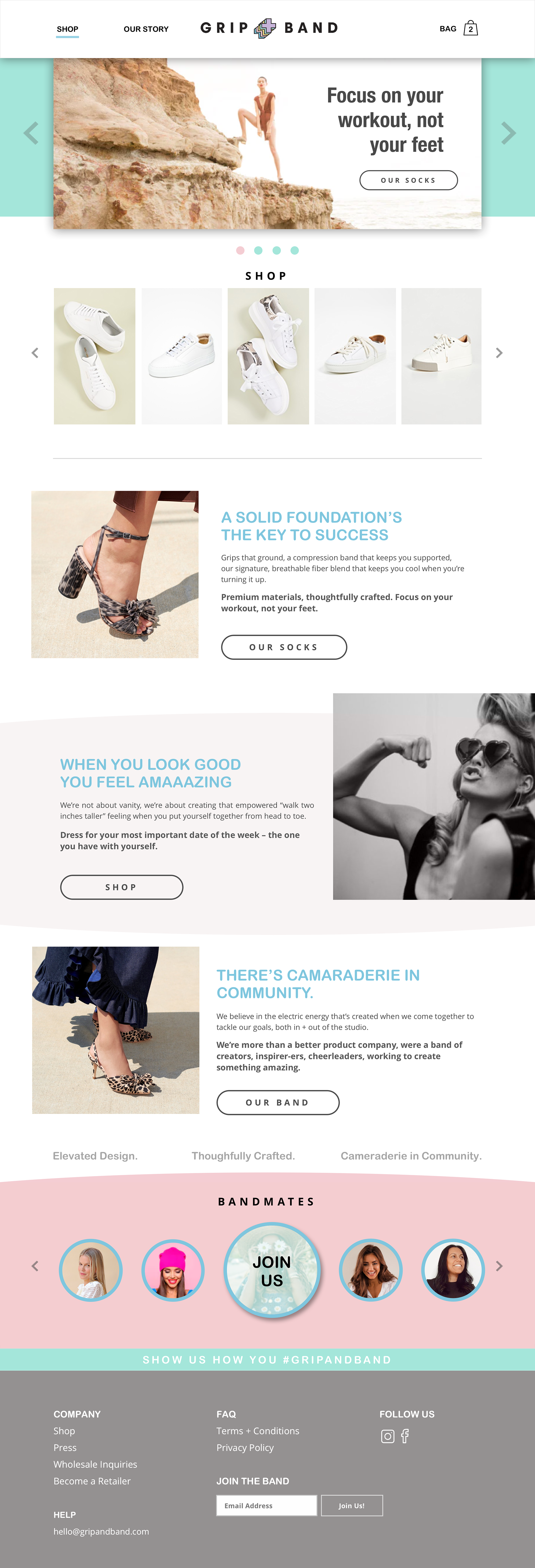
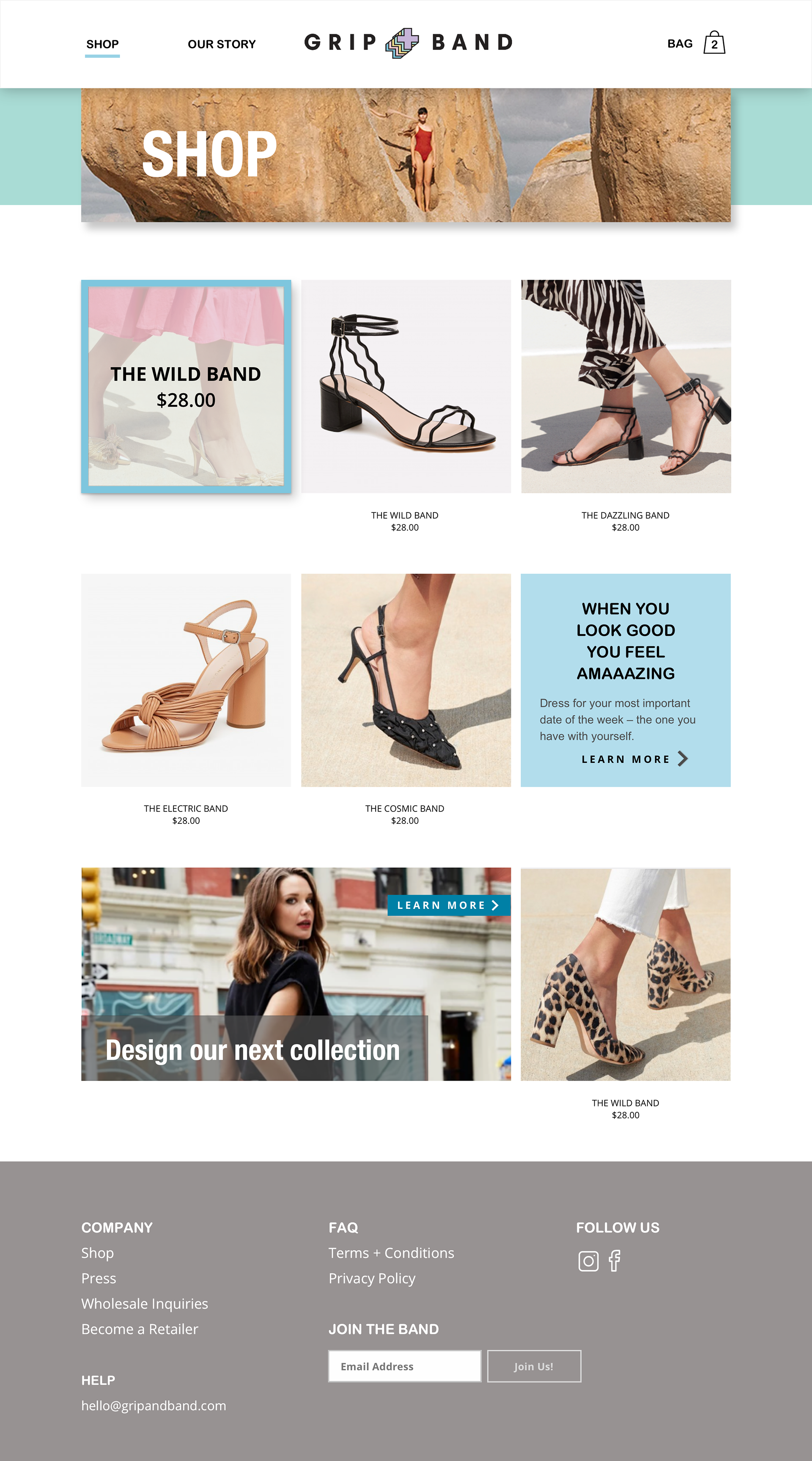
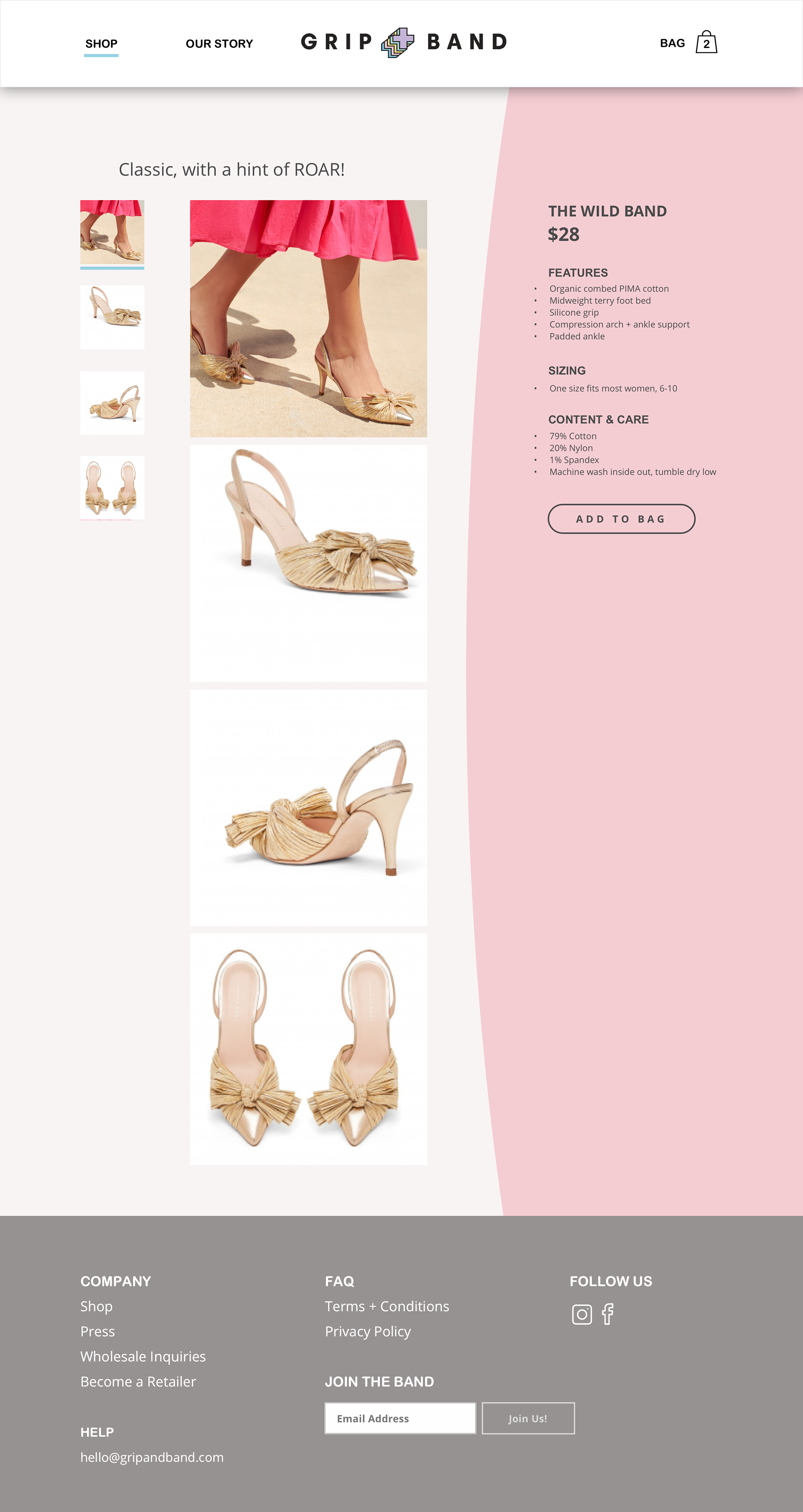
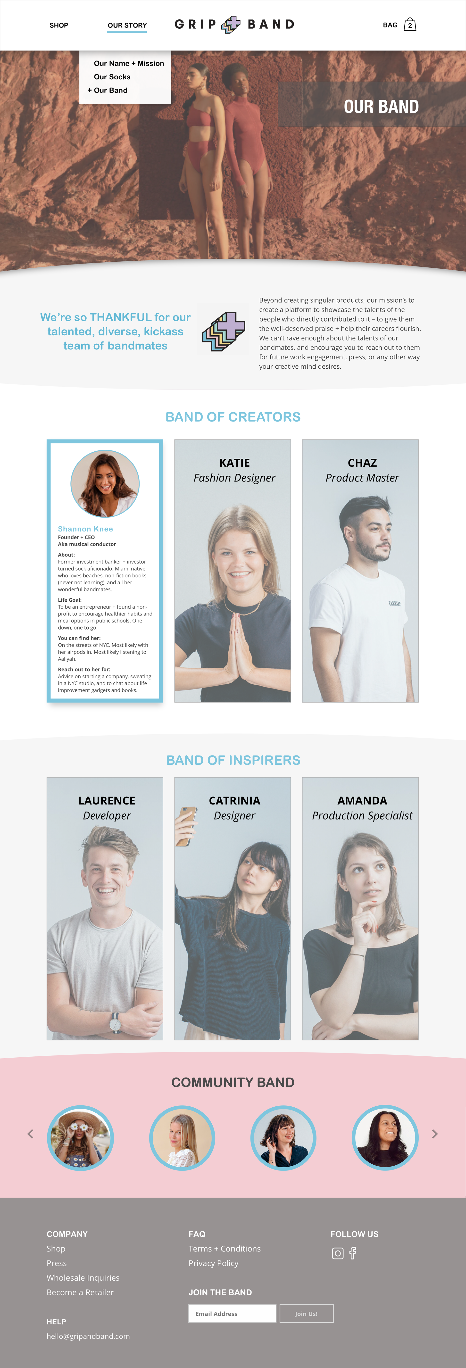
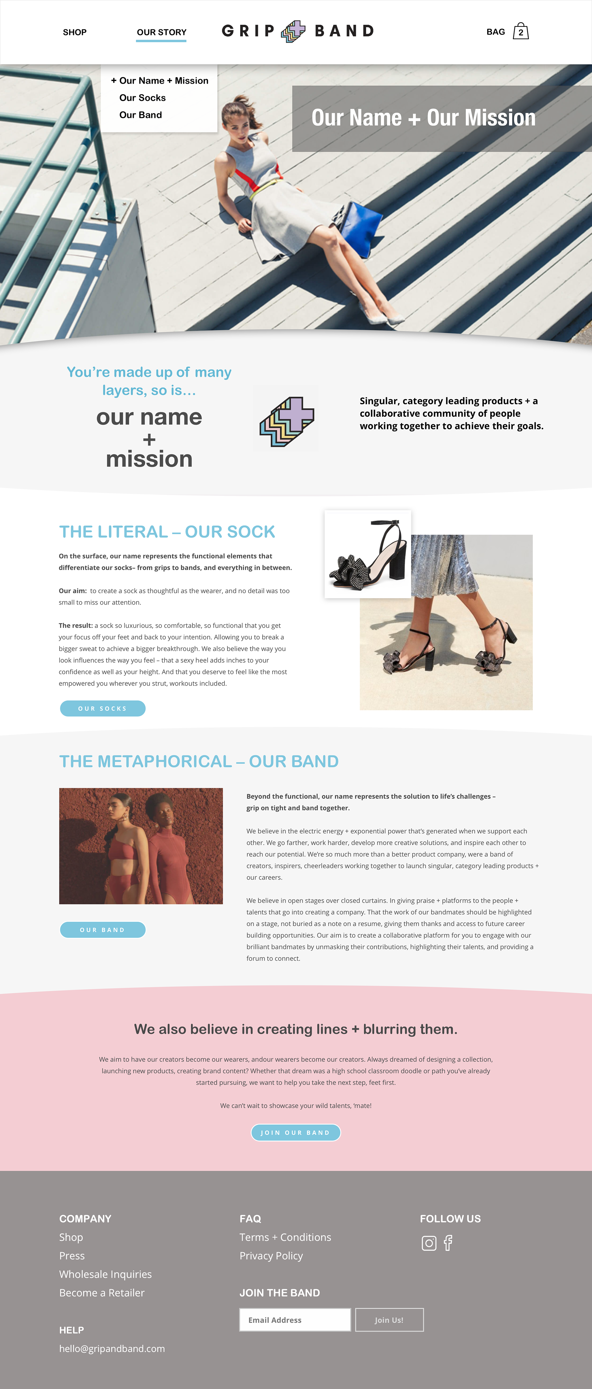
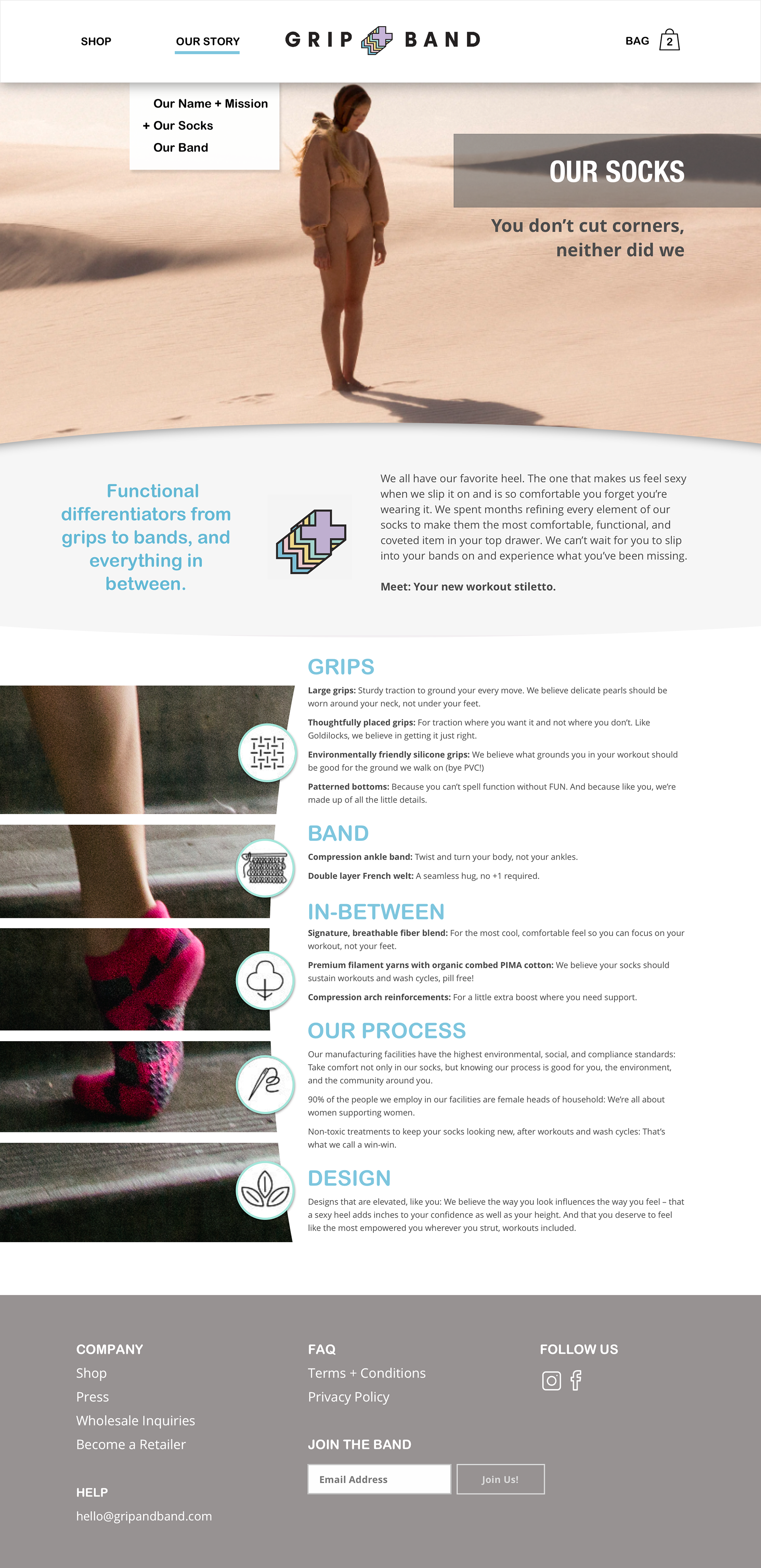
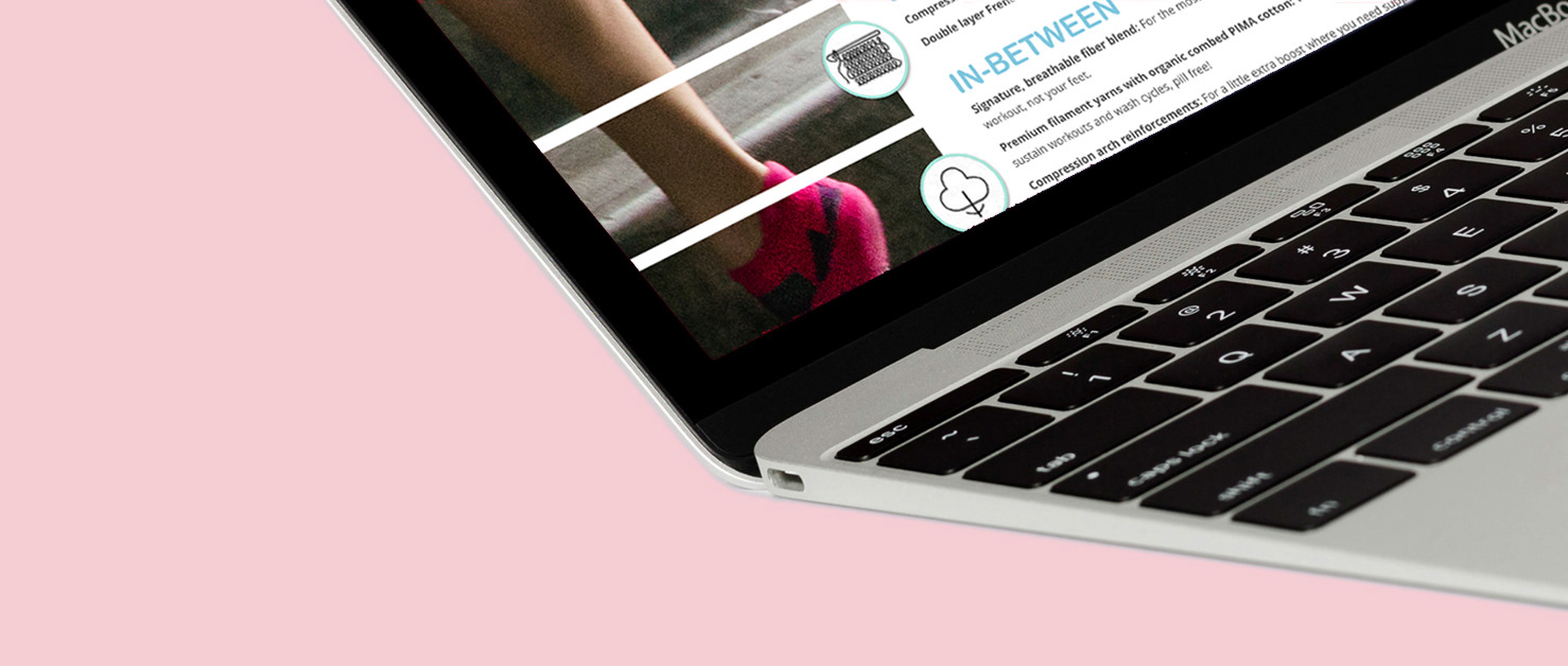
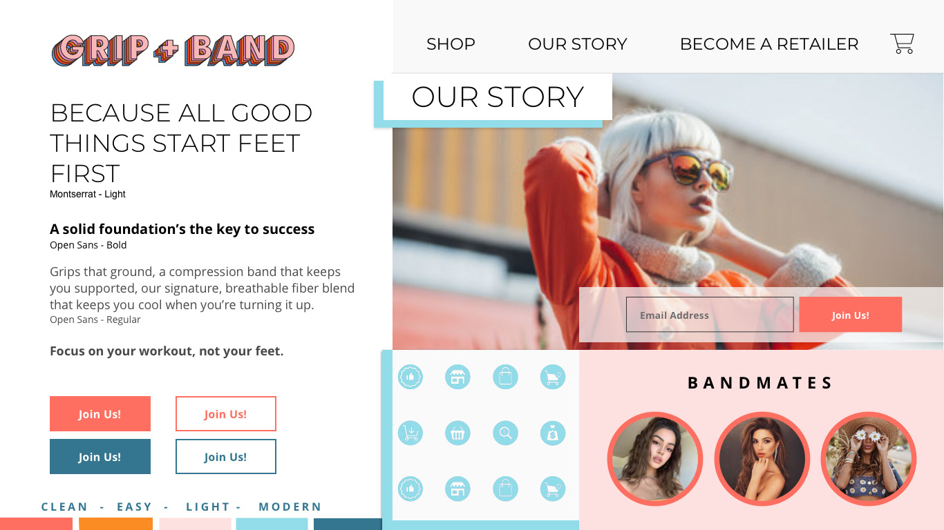
Final High Fidelity Designs & Prototype
After testing each iteration of high fidelity screens and developing key insights, design decisions and strategies, here are the final high fidelity screens: