Today I am continuing with the Daily Ui Challenge #011. This brief was to design a flash message with both the outcome for an error and success.
Today's hint was very brief:
Is it for a sign up form? A download/upload message?
Tools:
Pencil sketching, AdobeXD, Adobe Photoshop, Adobe Illustrator.
My Challenge:
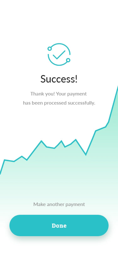
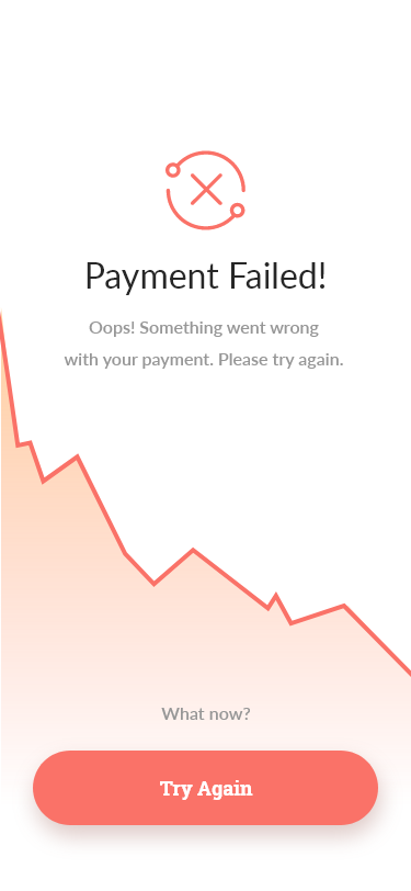
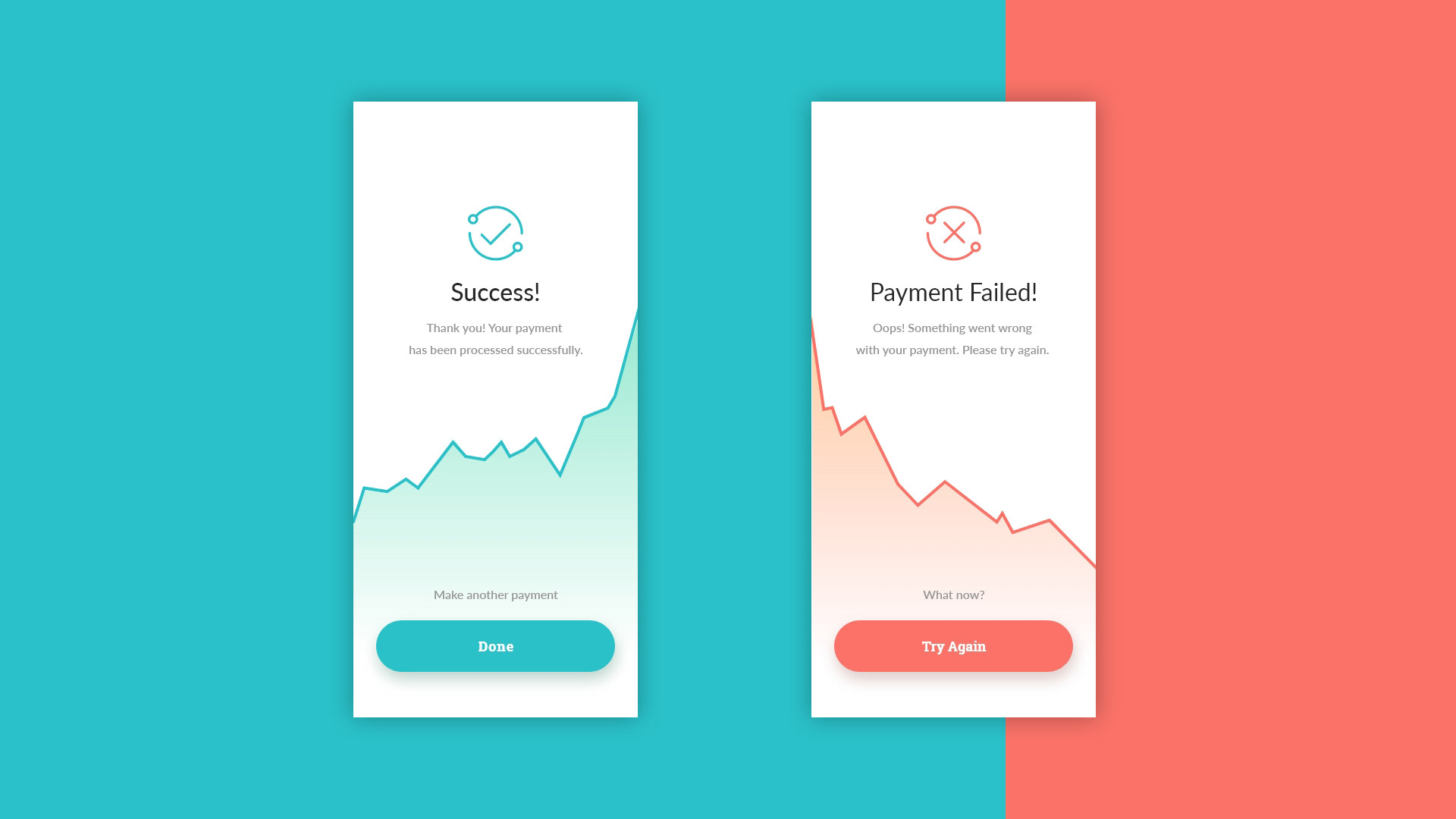
For my interpretation of the flash message screens, I created 2 screens for money transfer application similar to Venmo and Zelle. I designed one screen for a successful payment transfer and one for an unsuccessful payment.
The Process
RESEARCH, ANALYSIS
Research and anaylsis consisted of testing my personal money transfer application and a visual comparison of several other competing applications. Chase bank (Zelle) has a clear success message. The green color stands out and the the iconography of the check mark was animated to give an extra visual cue to the user that the transaction was successful. By using the language that sounds almost like someone is speaking to you, the message is more human and user-friendly. I plan to emulate these characteristics in my designs.
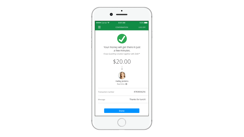
Chase Bank's Quickpay with Zelle - Success Flash Screen
EXPLORATION & IDEATION
Colors:
I used colors that were branded to match the application - blues and muted oranges. At the same time I wanted to use colors that users would immediately recognize as success (green) and error (red).
I used colors that were branded to match the application - blues and muted oranges. At the same time I wanted to use colors that users would immediately recognize as success (green) and error (red).
Fonts:
Lato, Roboto Slab
Lato, Roboto Slab
Final Design:
1. I used Green and Red which are commonly understood to mean success and error.
2. Chose tones that still matched the applications branding (hints of blues and muted oranges)
2. I used friendly and human tone which is especially important for the error message.
3. People respond to imagery so I incorporated the iconography (check and "x")